

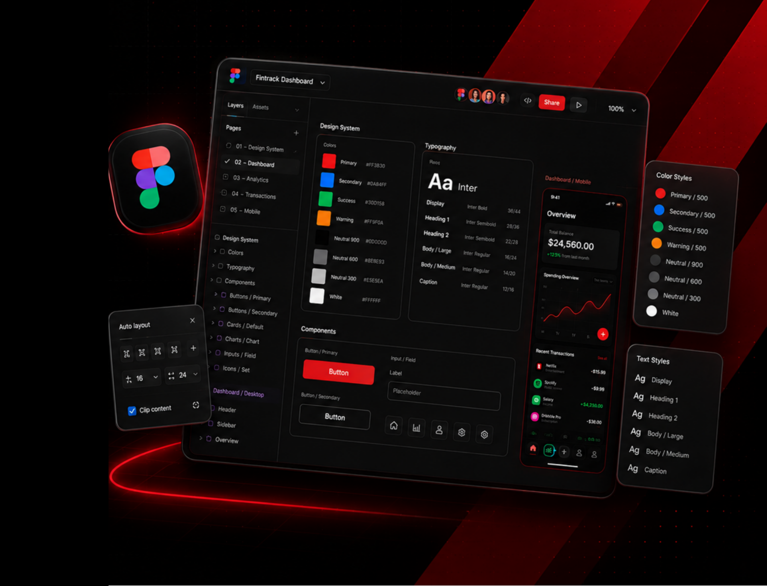
FIGMA DESIGN SERVICES

FIGMA UI/UX DESIGN BUILT FOR CLEAR DIGITAL EXPERIENCES.

We craft intuitive interfaces and seamless experiences with smart UX thinking. From wireframes and prototypes to design systems and responsive layouts — we deliver pixel-perfect designs ready for developer handoff.

START FIGMA UI/UX PROJECT
Figma UI UX Design Services
FIGMA DESIGN CHAPTERS

A WEBSITE BECOMES PREMIUM WHEN EVERY SCREEN HAS A CLEAR PURPOSE.

COMPLETE INTERFACE SYSTEM

This Figma UI/UX direction is planned like a complete interface system. Each screen, section, component, and interaction has a clear role in helping users understand, navigate, and take action.

CHAPTER / UX STRUCTURE 01

UX STRUCTURE THAT TURNS A RAW IDEA INTO A CLEAR WEBSITE JOURNEY.

The design starts by mapping user goals, page priorities, navigation logic, and key conversion moments before polishing the interface.

UX FLOW WIREFRAME LOGIC SCREEN PRIORITY
CHAPTER 02

FIGMA INTERFACE DESIGN THAT FEELS CLEAN, PREMIUM, AND EASY TO USE.

The website screens are designed with consistent layout rhythm, strong hierarchy, reusable components, and mobile-friendly interaction logic.

UI SCREENS COMPONENTS PROTOTYPE FLOW
CHAPTER 03

DEVELOPER-READY DESIGN SYSTEM THAT STAYS PRACTICAL AFTER HANDOFF.

Design system, spacing, buttons, cards, forms, breakpoints, and states are organized so developers can build the design without losing quality.

DESIGN SYSTEM RESPONSIVE STATES DEVELOPER HANDOFF
UX/UI UPGRADE

THE GOAL IS NOT JUST BEAUTIFUL UI. IT IS USABLE CLARITY.

BEFORE / AFTER

The Figma UI/UX process removes unclear layouts and replaces them with a more structured, user-friendly, and development-ready website experience.

BEFORE SERVICE STATE AUDIT

THE WEBSITE IDEA EXISTED, BUT THE USER JOURNEY WAS NOT CLEAR ENOUGH YET.

Before the Figma process, the website direction had content and ideas, but screens, user flow, hierarchy, and interaction logic were not organized into a clean UX system.

42% FLOW CLARITY
38% UI CONSISTENCY
35% HANDOFF CLARITY
01
OFFER CLARITY THE USER FLOW FELT UNCLEAR

Page order, navigation path and conversion steps were not mapped clearly enough.

02
SCREEN STRUCTURE SCREENS FELT ARRANGED, NOT DESIGNED

Layouts existed, but they did not create a smooth journey from entry to enquiry.

03
UI LAYER THE INTERFACE LACKED VISUAL CONSISTENCY

Typography, spacing, cards, buttons and section rhythm were not yet aligned.

04
BUILD PATH THE HANDOFF WAS NOT DEVELOPER-READY

Responsive states and component logic were not clear enough for implementation.

BEFORE RESULT

The idea existed, but it was not yet ready as a premium Figma UI/UX system.

UNCLEAR FLOW MIXED UI WEAK HANDOFF
AFTER SHARTOR INTERVENTION

WE TURNED THE WEBSITE IDEA INTO A CLEAR, PREMIUM FIGMA UI/UX DESIGN SYSTEM.

Screens, components, visual hierarchy, responsive states and prototype flow now work together as one polished website experience.

89% FLOW CLARITY
84% UI CONSISTENCY
91% HANDOFF CLARITY
01
POSITIONING WORK WE CLARIFIED THE USER JOURNEY

Website flow, page priorities and interaction paths were mapped clearly.

02
WIREFRAME SYSTEM WE CREATED A CLEAN SCREEN STRUCTURE

Wireframes now support hierarchy, navigation and responsive behavior.

03
UI UPGRADE WE DESIGNED A CONSISTENT INTERFACE SYSTEM

Typography, spacing, buttons and layouts now follow one premium direction.

04
HANDOFF PATH WE MADE THE DESIGN DEVELOPMENT-READY

Components, responsive screens and prototype notes are organized for build.

AFTER RESULT

The website now works as a premium Figma design system — easier to navigate, understand and build.

CLEAR UX FLOW PREMIUM UI BUILD-READY HANDOFF
BUILD PROCESS

A PREMIUM FIGMA UI/UX PROJECT NEEDS A FOCUSED DESIGN SEQUENCE.

FROM DIRECTION TO HANDOFF

The process is kept simple and practical: define the user journey, create wireframes, design polished Figma screens, prototype the flow, and prepare developer handoff.

01
DISCOVERY / STRUCTURE STEP 01

DEFINE THE UX DIRECTION

Clarify user goals, website objectives, page priority, navigation flow, and the key action each screen should support.

02
STRUCTURE / FLOW STEP 02

CREATE WIREFRAMES

Build low-fidelity structures for the main website screens so layout, content hierarchy, and user movement are clear before visual design.

03
HIGH-FIDELITY UI STEP 03

DESIGN THE UI SYSTEM

Create high-fidelity Figma screens with consistent typography, color use, spacing, cards, buttons, forms, and responsive rules.

04
DEVELOPMENT PATH STEP 04

PREPARE HANDOFF

Organize components, screen states, spacing rules, assets, and design notes so developers can build the website accurately.

DELIVERABLES

WHAT THE FIGMA UI/UX WEBSITE DESIGN INCLUDES.

DESIGN OUTPUT

The output focuses on making the website flow clearer, the interface more premium, and the final design easier to build correctly.

01

SCREEN STRUCTURE PLAN

User journey, screen order, navigation logic, and conversion-focused website flow.

UX / FLOW
↗
02

HIGH-FIDELITY FIGMA UI

Desktop and mobile website screens designed with polished visuals, strong hierarchy, and clean interface patterns.

UI / FIGMA
↗
03

RESPONSIVE SCREEN SYSTEM

Desktop, tablet, and mobile screen planning with consistent spacing, layout behavior, and interaction clarity.

RESPONSIVE / PROTOTYPE
↗
04

DEVELOPER HANDOFF SYSTEM

Figma file prepared with components, assets, spacing notes, prototype links, and developer-ready structure.

HANDOFF / BUILD
↗
04

CLEAR UX FLOW. POLISHED FIGMA SCREENS. RESPONSIVE LOGIC. DEVELOPER-READY HANDOFF.

START YOUR FIGMA PROJECT

TURN YOUR WEBSITE IDEA INTO A PREMIUM FIGMA UI/UX SYSTEM.

Build a clearer website experience before development begins — with structured UX flows, polished interface screens, responsive design logic, and a cleaner developer handoff.

READY TO START?

LET’S DESIGN THE EXPERIENCE BEFORE WE BUILD IT.

Tell us about your website, users, goals, and current challenges. We can shape the right Figma UI/UX direction around the project.

01 / UX CLEAR USER JOURNEYS
02 / UI PREMIUM FIGMA SCREENS
03 / RESPONSIVE DESKTOP TO MOBILE LOGIC
04 / HANDOFF DEVELOPMENT-READY SYSTEM