

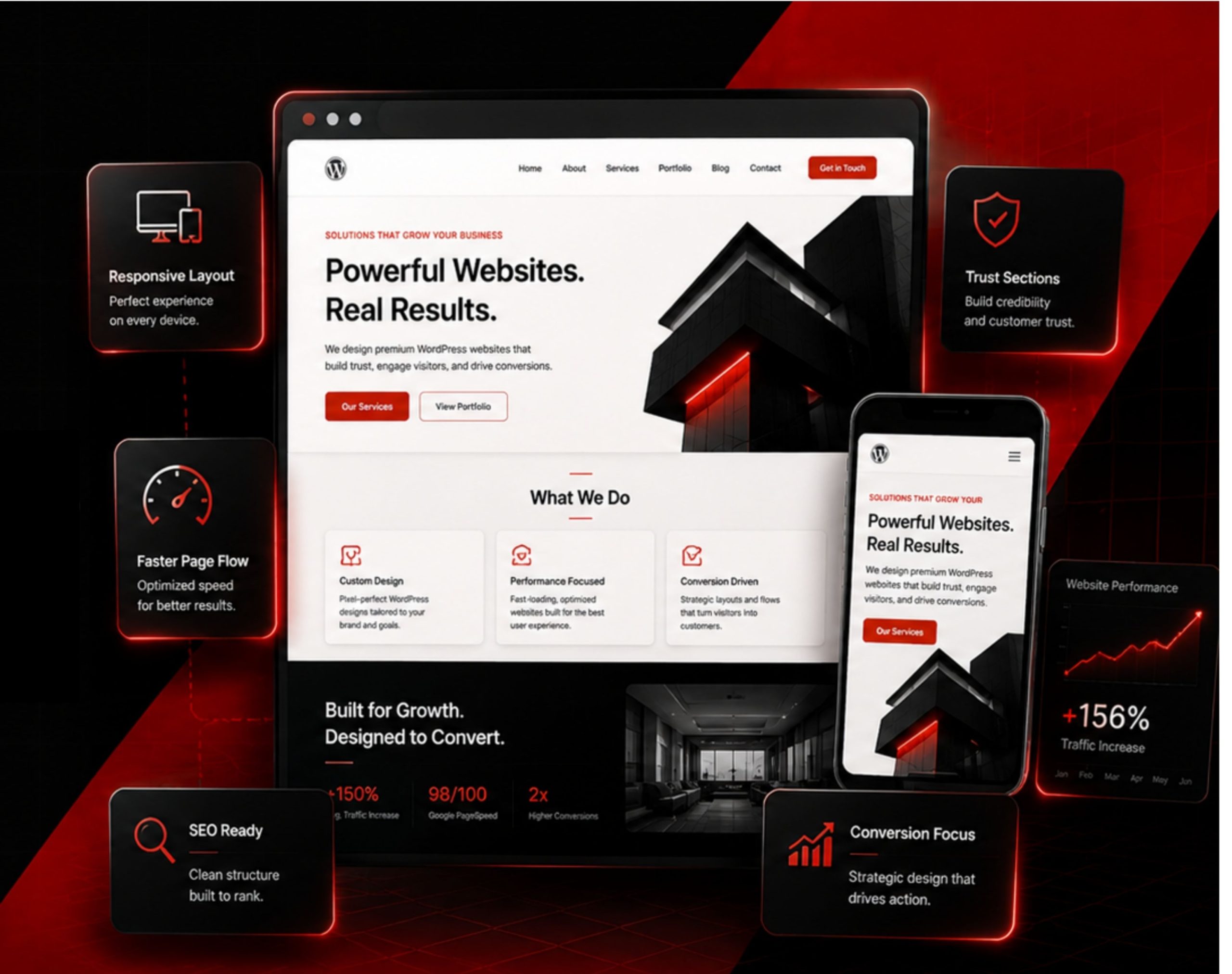
FIRST SCREEN THAT EXPLAINS THE BUSINESS WITH AUTHORITY.
The hero is designed to communicate the service, value, audience and next step quickly without making the opening screen feel crowded.
Benefits, process, proof, FAQs and deliverables are connected into one readable decision path instead of feeling like separate content blocks.
Typography, spacing, contrast, interaction and responsive behaviour follow one system so the experience remains polished on every screen.
The new website direction removes the generic template feel and replaces it with a sharper, more intentional business presentation.
Visitors could read the information, but the message, structure, trust depth and enquiry direction were not working together with enough clarity.
The opening section was not sharply explaining what the WordPress service solves, who it serves and why it matters.
Content blocks existed, but they did not deliberately move visitors from interest to trust to action.
Benefits, proof and process cues were too light to make the service feel polished and higher-value.
The action area was not strong enough to make the next step feel obvious.
The page could introduce the service, but it was not building enough trust or decision confidence to feel premium.
The message, structure, trust system and CTA now work together with a sharper business voice and a more persuasive flow.
Headline, support copy and benefit framing now explain the offer faster and with more confidence.
Explanation, value, proof, process, comparison, FAQs and CTA now follow a more intentional sequence.
Better hierarchy, supporting points and cleaner visual rhythm make the service feel more established.
The action area now feels more confident and aligned with the enquiry journey across devices.
The page now reads like a premium service pitch — easier to understand, easier to trust and easier to enquire from.
The process stays simple and practical: define the message, structure the journey, design the interface and prepare the page for WordPress implementation.
Define the page’s main promise, audience, service value and the action visitors should take next.
Plan the order of hero, proof, services, process, deliverables, FAQs and CTA sections.
Create a polished layout with consistent typography, spacing, contrast, interaction and responsive behaviour.
Keep the final design practical for Flatsome, UX Builder, WordPress or clean custom HTML/CSS implementation.
The output focuses on making the page clearer, more premium, easier to trust and easier to implement correctly.
Section order, message hierarchy and conversion-focused page journey.
Hero, service sections, proof blocks, process areas, FAQs and CTA layout direction.
Desktop, tablet and mobile behaviour with consistent spacing and hierarchy.
Design prepared for Flatsome, UX Builder, WordPress or custom HTML/CSS.
If your current website feels generic, unclear, or outdated, this design direction turns it into a premium page experience with better structure, stronger trust and a cleaner enquiry path.